
In this case-study, I will use supervised and unsupervised machine learning techniques to analyse real estate market data.
Exploratory data analysis
After importing the necessary libraries and the dataset, I start by checking its dimensions and composition. The dataframe has 414 rows and 8 columns. Although this is not large enough to create accurate machine learning models, it suffices given the pedagogical objective of the analysis.
I check for mixed-type data, missing values, and duplicates. After fixing a couple of issues, namely renaming the variables for better readability, I am good to go.
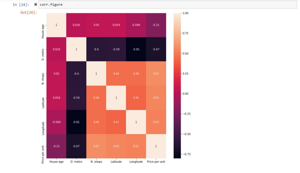
I start with correlation analysis. This is an effective tool to quickly identify correlated variables that can be later used to perform predictive analysis. In this case, I will construct a correlation matrix and a heat map. Both tools enable me to quickly survey the level of interdependence between the variables in the data set.
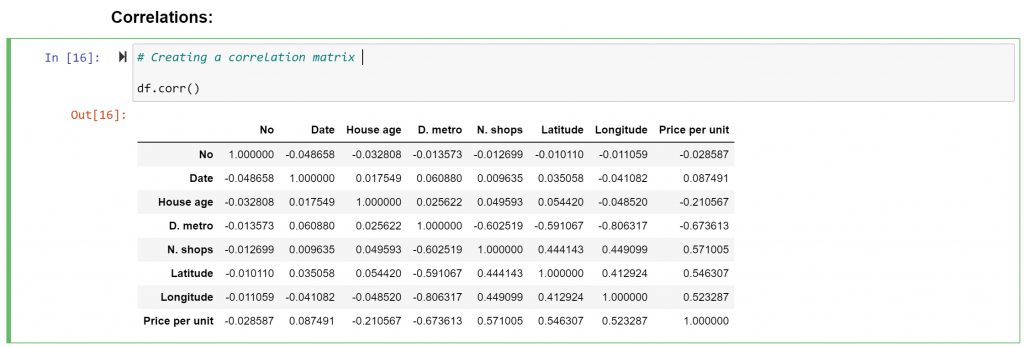
I decide to exclude variables that do not carry any pertinent information, such as “Date” and “No” from the subset. This operation increases the readability of the heat map.
I decide to use the “Price per Unit” variable as a dependent variable. This is an important variable for real estate analysts, as there is obvious value in answering the following research question:
Which factors have the most impact on the price of real estate?
By understanding what variables impact real estate prices, owners and brokers can improve their valuation decisions. From the heatmap above, I immediately spot some interesting research paths:
- The correlation between “Price per Unit” and “House Age”: A -0.21 coefficient indicates a weak negative correlation. This could be interpreted as “the older the house, the lower the price,” and vice versa.
- The correlation between “Price per Unit” and “D. metro”: A -0.67 coefficient indicates that a shorter distance to a metro station equates to a higher price per unit (along with its opposite scenario).
- The correlation between “Price per Unit” and “N. shops”: A 0.57 coefficient indicates a medium-to-strong positive correlation, which makes sense—the more convenience stores in the area, the higher the price per unit.
I decide to use a pair plot to quickly visualise these, and other, relations in the dataset, so I can make a final decision to which ones investigate further:
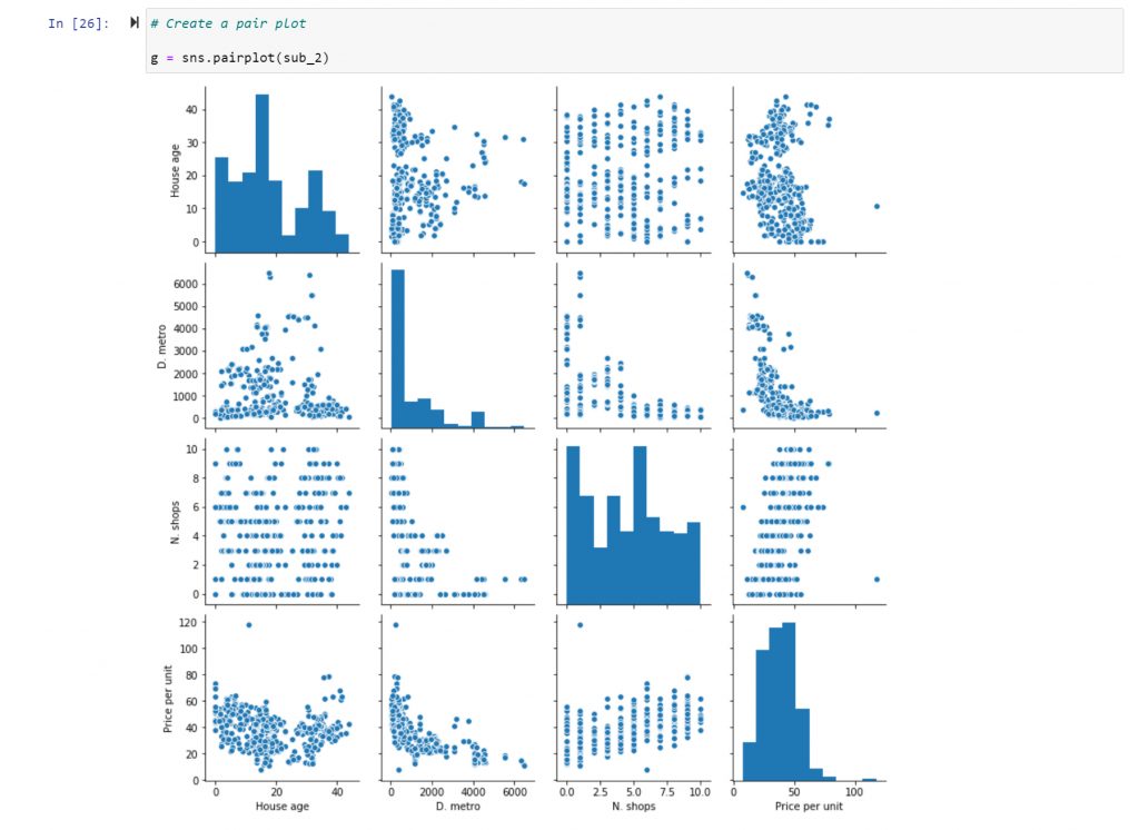
The relationship between the “Price per Unit” and the “House Age” looks promissing. From the correlation analysis, I know that there’s a connection, but I do not know if it follows a linear relationship. In order to investigate further, I use a scatterplot:
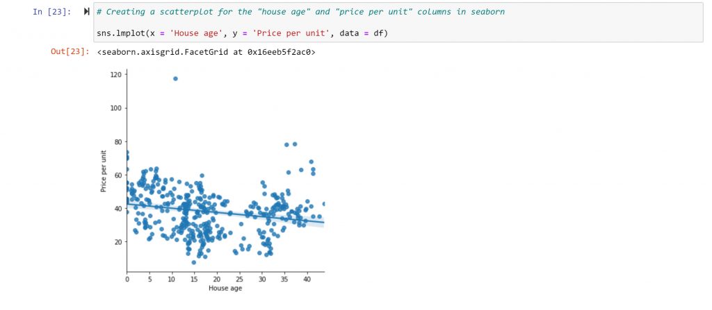
In the scatterplot, I can see that there is, indeed, a weak negative relationship. The trend line isn’t very steep, and there are many points far away from this line.
But the relationship between the two variables is not purely linear. There is also an upward trend when the age of the house hits thirty. This might make sense, as many people like older houses for architectonic reasons. There are also many points that do not fall close to the trend line.
These two aspects of the distribution, its non-linearity, and significant data variance, impact the correlation coefficient and raise new questions for further exploration. Why is there such variance? What caused the outlier? What impacts the rise in value for houses after a certain age? All of these can be questions for furthering your analysis.
Supervised Machine Learning: Regression
Having conducted some exploratory data analysis, I am now able to generate some hypotheses. As shown, there is a strong negative correlation (-0.67) between “distance from a metro station” and “price per unit”, suggesting that price decreases as distance to metro station increases. I can also assume that the relationship has some degree of linearity based on the generated scatterplot. I will test the following hypothesis:
“The shorter the distance to a metro station, the higher the price.”
To test it, I will run a simple linear regression with a single independent variable. But before, I must do some data preparation: reshaping the variables into NumPy arrays and splitting each variable into a training and test set. Only then can I fit the regression object to the training data.
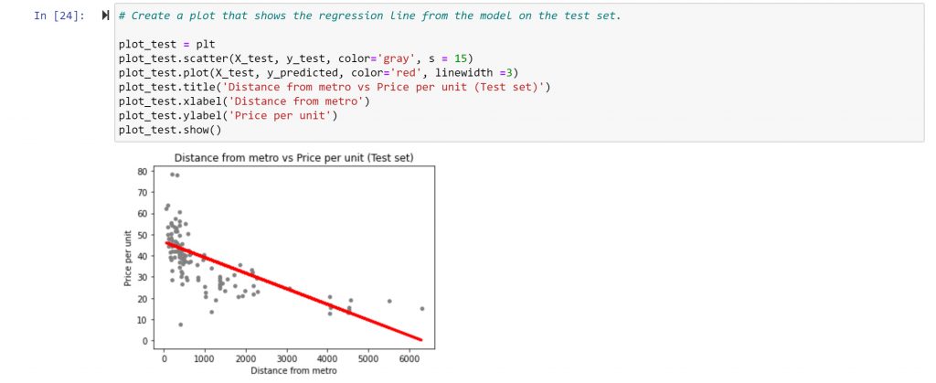
From the visualisation, it can be seen that the linear model doesn’t perfectly cover all of data points. In the area where the distance to metro stations is small (up to 2000m), for example, there are still many data points that indicate low price, which contradicts the stated hypothesis.
To check the accuracy of the model, I look at some of the model’s summary statistics, namely, slope, root mean squared error, and R2 score.
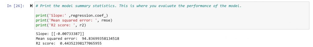
The negative slope value indicates a negative relationship. As X rises (as the distance from a metro station rises), y slightly drops (the price per unit drops) at a degree of 0.0073.
The root mean squared error (MSE) is an estimator that measures the average of the squared difference between the estimated values and the true values. The larger the distance, the farther away the regression line is from the data points, indicating that the regression line is not an accurate representation of the data. A small MSE, however, means that the regression line passes fairly close to the observations, making it a good fit.
In this case, the MSE is quite large at -100.913, and so, it’s safe to say that a regression may not be the best model to represent this data and can’t accurately predict the influence of distance to a metro station on the price of a unit.
The R squared is a metric that tells us how well the model explains the variance in the data. Normally, it lays between 0 and 1, where values closer to 0 indicate a poor fit, and values closer to 1 indicate a good fit. In this case, the R2 score for your model is 0.4435, which is not that great.
The conclusion is that the model is not performing well. There is quite the difference between the actual and predicted y values. The relationship does not follow a single, straight regression line. While the “distance to metro stations” is an important factor in price formation, it is not the only one. It plays a large role when there is a large distance to metro stations, but it does not play as large a role when there is less distance.
The next step would be to create a multiple regression model, able to predict prices based on more than just one variable.
Unsupervised Machine Learning: Clustering
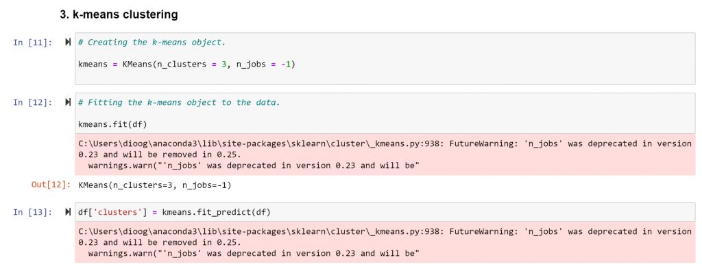
Clustering is a technique to group data points in a meaningful way in order to identify similar subgroups (clusters) within the data. In this case-study, I will use the k-means algorithm to perform the clustering procedure.
I start by applying the elbow technique to decide in how many clusters to group your data in.
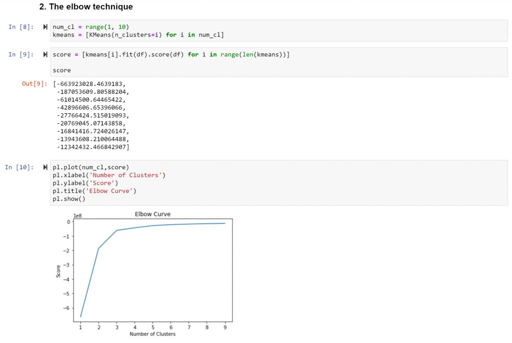
The result the optimal count for clusters is three. I follow by creating the k-means object and by running the appropriate code.
Now that the clusters were created, I created a plot and assigning each cluster a different colour.
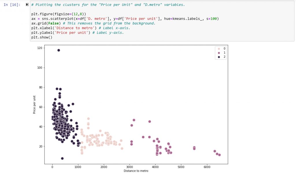
The next step is to interpret the resulting visualization. The first cluster, in dark purple (coded as “2” in the legend), is also the most populated cluster. It gathers the data points with very short distances to metro stations and relatively high prices (with the exclusion of some extreme values at the top and bottom of the price-per-unit range).
The second cluster, in pink (coded as “0” in the legend), includes points with greater distances from metro stations and lower prices than the first cluster—but higher on average than the third cluster. The third cluster, in medium purple (coded as “1” in the legend), contains the points with the furthest distance from metro stations and the lowest prices.
I decide to repeat the procedure using different variables: “House Age” and “Price per Unit”:
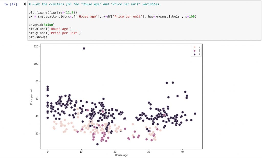
In this case, no visible linear connection between the variables appears. One interesting observation is that there aren’t any brand-new houses, nor houses over 35 years old, in the medium purple cluster of points (coded as “1” in the legend). This cluster also represents the cheapest properties.
In the pink cluster (“0” in the legend), while there are a great deal more new houses than in the previous group, there are hardly any above 35 years of age. They also tend to be more expensive than the previous cluster.
This could lead to a conclusion that either very new or very old properties have higher values than those properties sitting somewhere in the middle. This conclusion is confirmed by the third dark purple cluster (“2” in the legend), making this an excellent example of a non-linear dependency.