
Storyboard Plan
Defining purpose
When designing a dashboard, it is important to answer key questions about who the final users are and why they’re using it. This way it is possible to decide what information to include. For this project, these were the answers I devised:
- Who is it for? Investors and the general public.
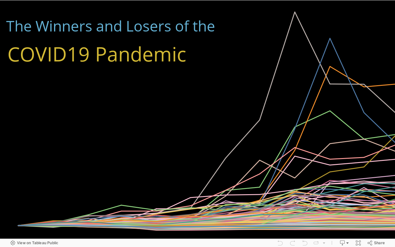
- Why is it being built? To communicate what companies and economic sectors are the winners and losers of the pandemic.
- What will it consist of? Two introductory visualizations depicting the stock market performance of the world’s most valuable firms and the different sectors they operate in. Next, visualizations showing the relative performance of firms in each sector is presented, accompanied by analysis. Finally, we inquire to what extend the firm’s size determined its stock market performance during this period and we present the results.
- Why is it being built? To communicate what companies and economic sectors are the winners and losers of the pandemic.
- When will it be used? Media publications, Independent interest, or academic study.
- Where will it be hosted? Tableau Public.
About the dataset
The dataset was extracted from the Bloomberg professional service terminal in late November 2020. It ranked the 5000 biggest firms in terms of market capitalization at current prices. The query also included indicators describing the firms and the prices of each stock on the first day of every month for a period of 12 months, from December 2019 and November 2020. This period was chosen as to understand the effects of the COVID19 pandemic on the companies’ value.
Steps taken
Data cleaning
I start by importing the dataset into Jupyter. After checking its dimensions and composition, I check for mixed-type data, missing values, and duplicates.

I see that the column “Best Analyst Rating” has 113 missing values. This is not enough to exclude it and imputation is not an option. I decide to leave it, as I do not plan to use this column at this stage. If necessary, at a later analysis stage, I could always create a new variable that acts like a flag based on the missing value.
Exploratory Visual Analysis with Python
After having “cleaned” the data, I will start by exploring possible relationships between the variables. I choose to use visual tools, charts, and graphs, to do this as I know that later I will have to report the results of my analyses.
I start with correlation analysis. I use pandas to create a correlation matrix for all the numerical variables in the dataset. This will indicate the level of interdependence between the variables. The results displayed show several cases of strong relationships (correlation coefficient of one), but I quickly note that all these cases refer to are correlations between prices of the same asset in different moments in time. I move on to creating a subframe that excludes prices and trying again.

As expected, the heatmap shows that there are no moderate or strong relationships in the dataset that are relevant for analysis. This was expected.
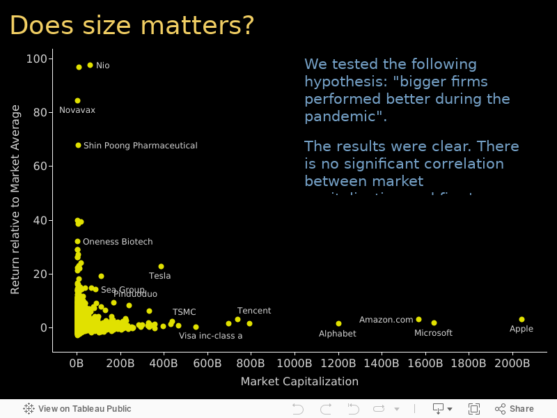
Nevertheless, for the sake of the exercise, I move to explore the relationship between market capitalization and 1-year total return (%). The Hypothesis being tested is “bigger firms performed better during the COVID19 pandemic”.
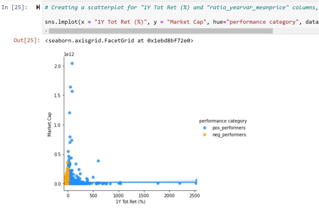
The results were clear. There is no significant correlation between market capitalization and firm’s performance. Therefore, in this instance, size did not matter.
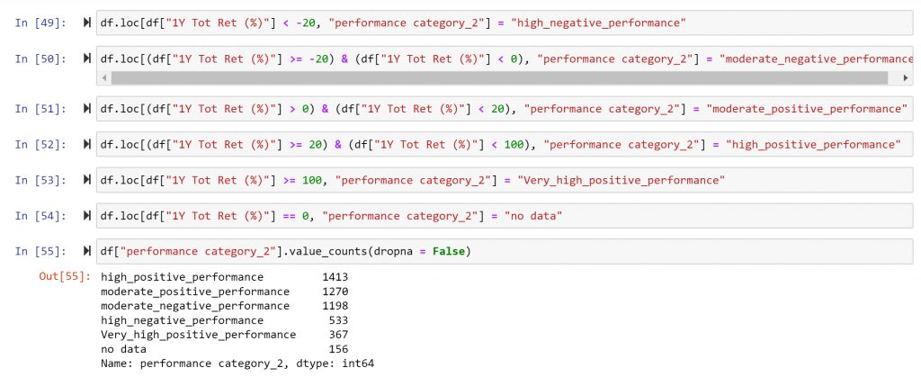
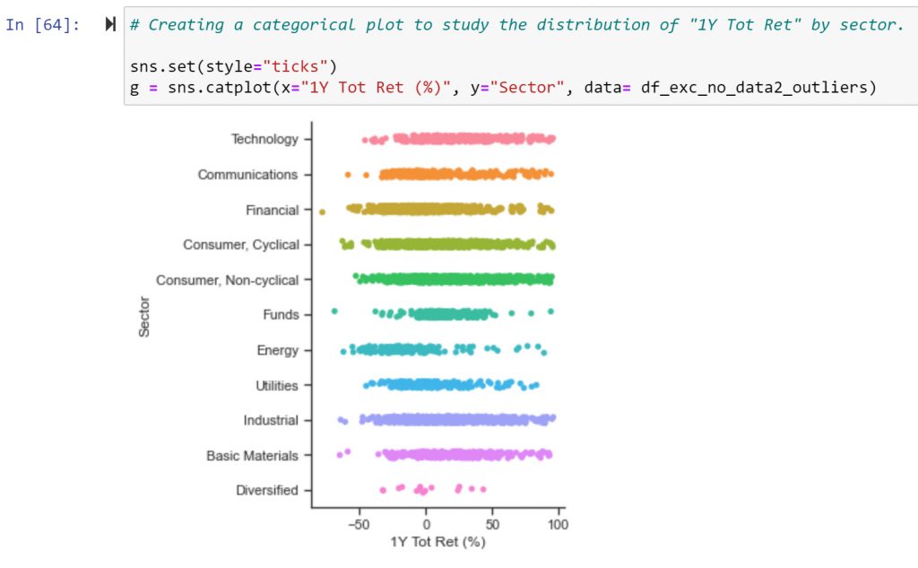
Still, I decided to dig a little dipper and created a catplot to compare categories within the variables’ distribution. To create the categories I used the .loc[] function in python.
The first impression I got from the catplot concerned the outliers. These are firms that saw their stock market valuation explode during the pandemic. Naturally, I was curious to know more about these companies and understand their amazing performance during this specific period.
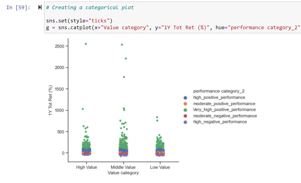
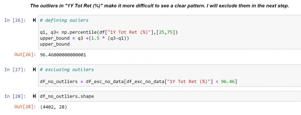
However, from a visualization standpoint, the outliers make it difficult to see the pack. So, I decided to remove them and redo the visualization. I used the following instructions to exclude them.
Here we can observe that the performance distribution of “1Y Tot Ret (%)” among the different value categories is relatively homogeneous, suggesting that market capitalization was not a determining factor for performance.

It is surprising to observe the number of companies that performed “high” in the context of a global economic recession. Understanding this paradox is especially important. This question will be addressed to the extent that is possible from the current dataset.
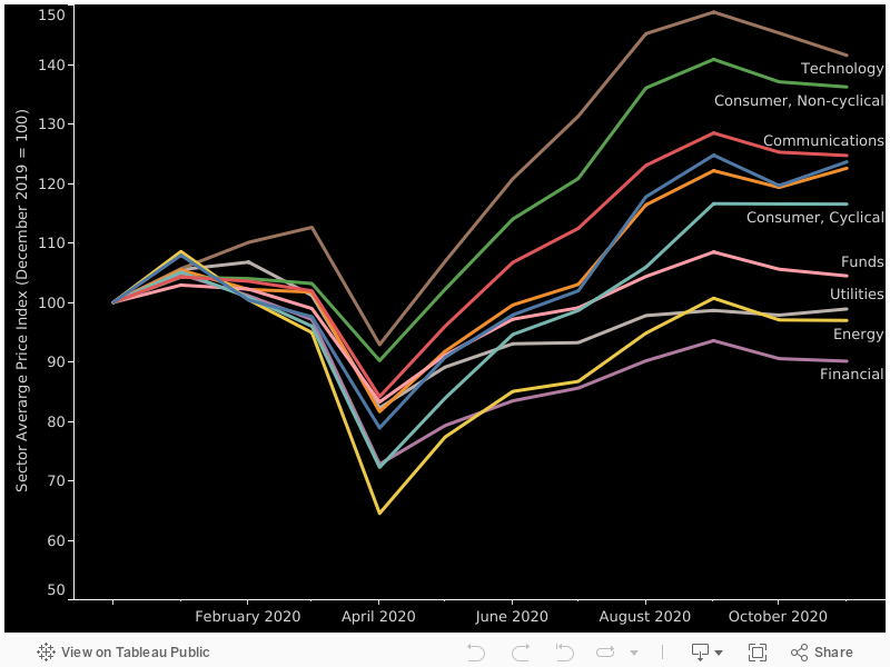
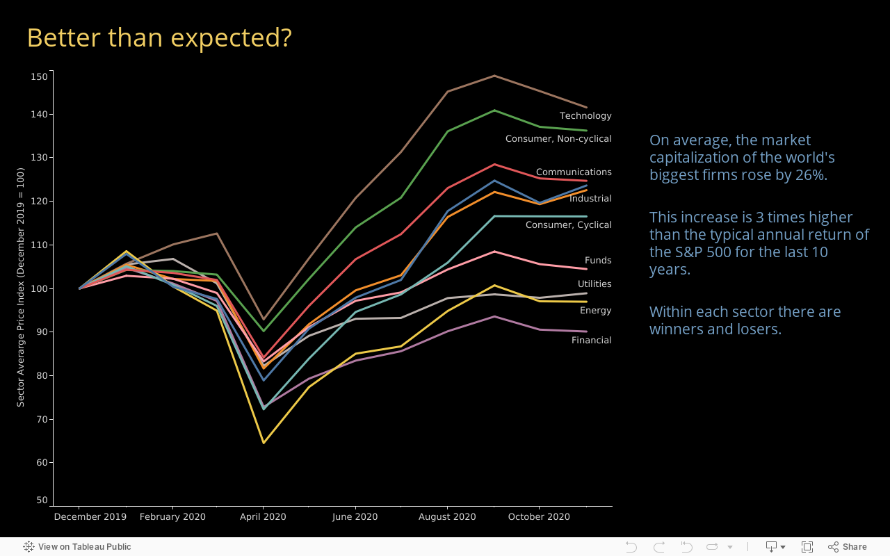
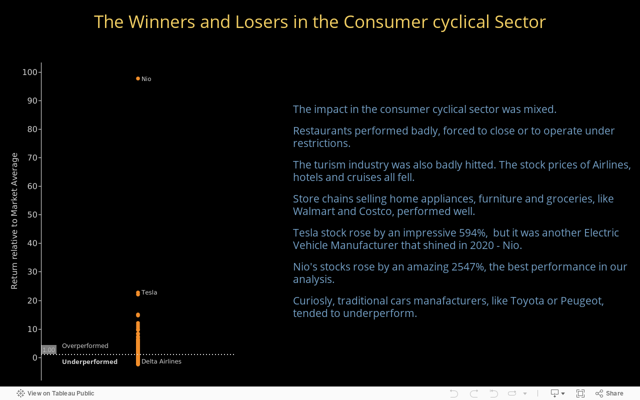
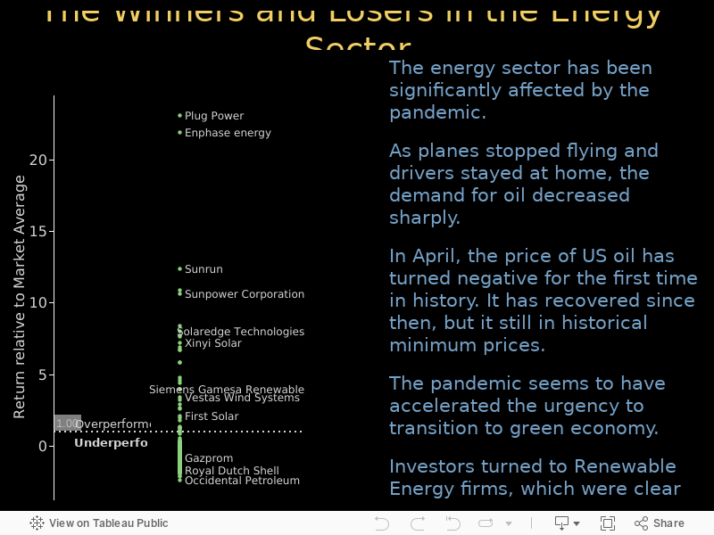
In the next step, I turned my attention to another research question “Which sectors are the winners and losers COVID19 pandemic?”
From this visualization, it is already possible to discern some preliminary analysis, namely that some sectors (technology, industrial) performed better than others (energy, utilities). But it is also interesting to observe that, in all sectors, there were winners and losers, suggesting that “sector” alone is not enough to explain performance and highlighting the need for a closer look into individual firm performance.
Creating Visual Dashboards in Tableau
I decided to move to Tableau, an interactive data visualization software to continue with my analysis. I started by exploring different ways to show how did different economic sectors performed during the period. After trying different options, I decided for an indexed time series.
Indexing data series is a common strategy when working with economic data, as it facilitates the comparison of numeric data over time.
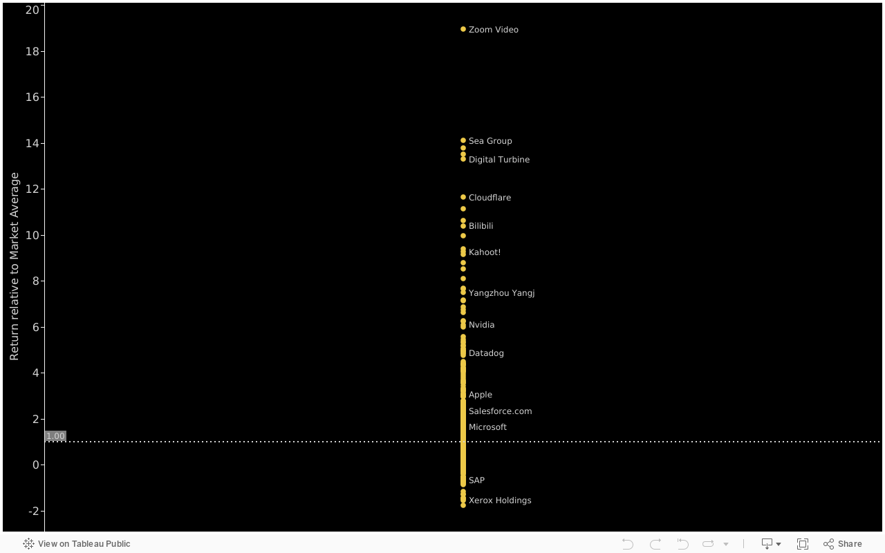
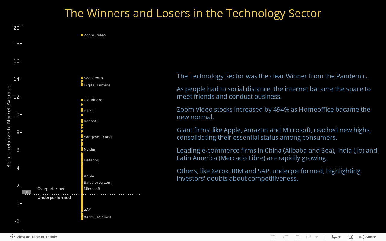
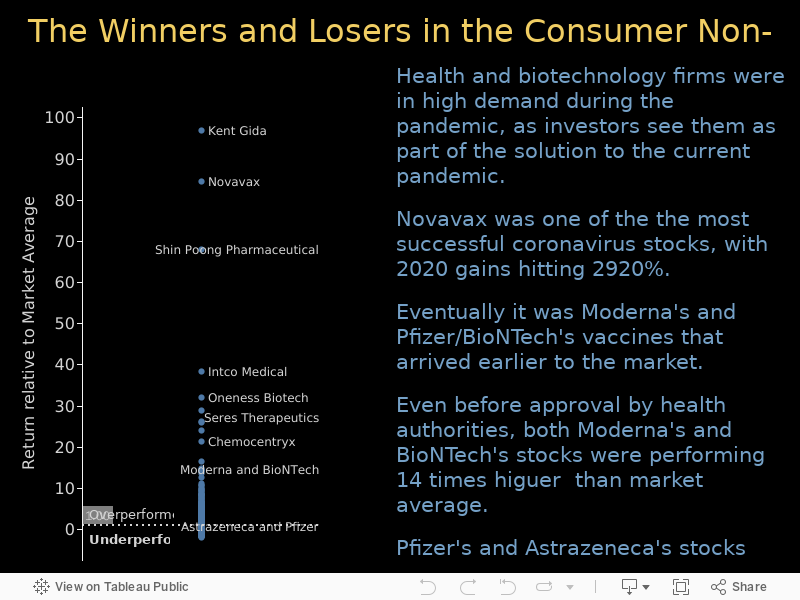
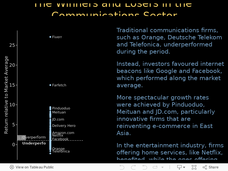
I liked the result and moved on to analysing firms’ performance within each sector. Because the objective was to compare the performance of different firms, I decided to create a new variable called “Excess Return”, a ratio between firms’ individual performance (%) and the average performance for firms in the same sector.
Finally, I aligned all the information is a series of dashboards that include economic and financial analysis that contextualize the viewers.
Thank you for your attention! Contact me in case you have any comments or questions. Click on the following buttons to know more about his project.